Environmental Concept Art 9
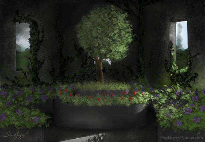
We just started working on a brand environment this week. Architecturally this area is going to be quite complex, in fact it’s probably going to be the most complex area in the comic. It doesn’t look complex right now because this is just the first concept art session between Shane and myself, and what’s painted below is a very small part of a very large structure, but we are starting off with establishing the most important part of the area: the mood.
One of the many things we carefully planned out for Hackberry Hollow was contrast, and specifically how and where it is used both in the story itself and in the artwork. In the case of this location we wanted to have towering stone cold architecture, windows that remind you of stained glass but have no color in them whatsoever. And yet in the middle of this large achromatic structure vibrant plant-life is carefully being grown inside, providing the only color seen anywhere in the entire complex.
And no, this is not a happy place.


Preston says:
October 31st, 2009 at 3:52 pm
I love the mood this environment gives. Great job!