Posted by Glen Moyes on Tuesday, 26 May, 2009
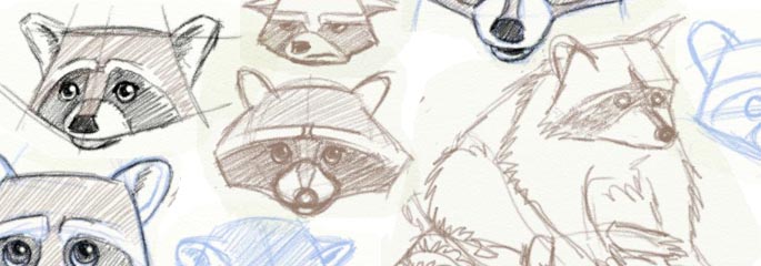
We have most of the set pieces in the works for Chapter 1 of the comic, but the other big task—and by big I mean huge, gargantuan, colossal, and monumental—is the character design. Part of what makes this part of the process such a big deal for us is that 1) we’ve never had to create so many character designs in one project before, 2) they’re all animals, which is another first for us, and 3) about half of all the characters that are in the comic will be shown in the first chapter, so at the very least we need to have all of those designs finalized by then, and we’d also like to have the rest of the character designs figured out by then as well.
Given that, you are going to be seeing a lot of critters and characters in the future. The rest of this post will include a couple of pages full of sketches showing the very beginnings of my design process for Derek: Preston’s pet undead raccoon that he taxidermied up to look less undead.

>> Read More
Posted by Adam Weber on Tuesday, 19 May, 2009
Glen had a lot of fun with four straight weeks of ego stroking, so I thought I would keep him on his toes a bit by posting some of the work that I’ve been doing.
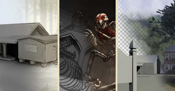
One of the main artistic goals in Hackberry Hollow is to have intricately detailed environments, but because we want to keep a strict production schedule we needed to come up with an effective workflow that would save us time without sacrificing quality. When we started doing concept art we realized very quickly that we were spending more time tweaking the underlying drawings than we were actually painting, and with three skilled modelers on our team it quickly became apparent that creating relatively detailed backgrounds complete with lighting would allow us to streamline production without sacrificing the nice painted look that we like.
Glen already revealed this part of our process, but what he posted so far has been experiments with the concept of using 3D mock-ups. Thus far we are very pleased with the results, so I set out to make one of the actual set pieces that will be used to create the final art in the comic. Seeing what we could do with quick 3D mock-ups for our concept art, imagine if you will what could be done with this:

>> Read More
Posted by Glen Moyes on Tuesday, 12 May, 2009
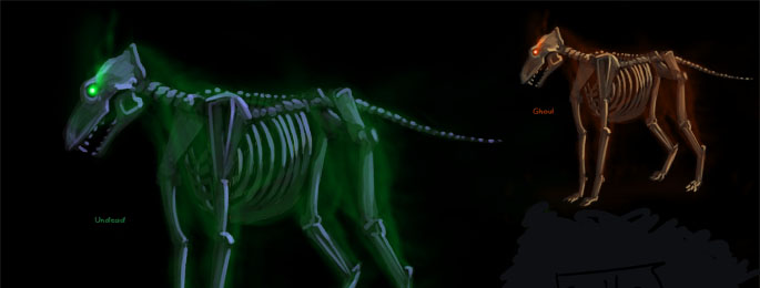
This past Friday we had yet another exhilarating writing session for the comic. That’s right. Adam came up with a really neat idea. Previously the plan has been to only have glowing red or green eyes to differentiate between ghouls and undead. Now, what if these creatures had a visible but ghostly muscle structure as well? Not only would that look wicked sick, but it would help illustrate how the magic system works. But most importantly it worked like magical caulking to help us fix a potentially big plot hole in the story.
One of the design ghoals [sic] for our ghouls [hyuk hyuk] was to somehow show how the magic system works without having to explain it. The characters in the story do some very clever things within the restrictions of the magic system, and we want it to be believable and very rewarding for the audience to read as they share in the character’s cleverness. To do that, we believe that the audience should be able to figure out how the magic system works on their own without hearing scads of exposition by a secondary character explaining what the heck just happened—just like in anime. ^_^
Anyway. Enough pontification. Here’s a few images showing how the new undead and ghouls may look like in the dark. Spooky!

>> Read More
Posted by Glen Moyes on Tuesday, 5 May, 2009
Did you know that there’s a 3D model hidden beneath most of the concept art we’ve done so far? Using 3D tools has helped us out a lot in creating concept art, and our plan is to use it extensively in the comic.

>> Read More
