Creature Concept Art 2
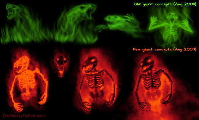
So far we’ve only shown ghosts once on the blog. From the very beginning we’ve been thinking that the ghosts would appear green, but this past Friday while Adam and I were writing the part of the script where the ghosts are introduced, we decided to make them red (more on this later). So here’s the new ghost design as well as the old ghost designs for comparison. I found it interesting that it has been almost exactly a year since our first ghost designs were created, and we just barely got around to revisiting them—just to give you some idea about how long we’ve been developing Hackberry Hollow.
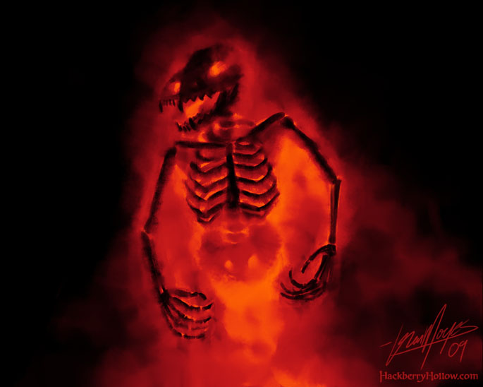
The bottom right design is the one we liked, and further down in the post we got the full-sized version of that ghost for you to look at.
I didn’t add any background elements to this piece of concept art, so you can’t see the transparent nature of the ghosts. The skeleton-looking part of the ghost design isn’t solid like physical bones would be. The bone area is the absence of mist, so the skeleton is actually completely see-through. Also the ghosts may not be as bright as I depicted them here since I’m thinking about toning down the mist effect a little bit.
So, why the color change from green to red?
When we first started writing for what would eventually be called Hackberry Hollow, the magic system was initially pretty loose and arbitrary. As time went on and we got the plot mostly figured out, we then started to nail down how the magic system works and what the limitations would be so there wouldn’t be any plot holes (which are really easy to have in a fantasy/sci-fi story). The other part of this is to visually communicate how the magic system works, and that’s why we have a color coding system which we mentioned briefly last month. Because of that, and how we made the ghosts work in the magic system, we decided to change the color from green to red to better communicate how these things are created and what their abilities are.
The other reason is that red looks awesome! Okay, that isn’t exactly why we did it, but we do like how forcing ourselves to stick with design principles and the rules of our magic system often helps us come up with cooler designs.


Erica says:
August 19th, 2009 at 12:08 pm
Yes, red looks awesome.
Since the bones are going to be the absence of mist, you might wanna consider loosing the highlights. They make the bones look tangible, almost Ghost-Rider-ish. The bone detail is incredible, and I like the contrast of the dark, intricate bone paired with the implied area where the black is absent (such as the pubic bone.)
Greak work, again. I completely support the change to red!
RH2 says:
October 5th, 2009 at 6:19 pm
I like your subtractive method instead of the regular additive luminous concept.