Interior Concept Art 1
Today we have a Hackberry Hollow first! For this week’s post we have an animated fly-through. Why? Because screenshots just wouldn’t do it justice, so we figured why not?
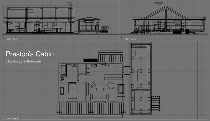
A few weeks back Adam reminded us that it was time to design the interior of Preston’s cabin. Our previous model didn’t have one, and to be truthful we really had no idea what the interior would actually look like. Well, Glen did, but when we put it down on paper it didn’t work, not only as a functional living space but also for events that happen quickly inside of the cabin when M.A.P.S. shows up. The script dictated how the cabin needed to be laid out, so Glen and I set to the task of redesigning it. Shortly after we began it became apparent that the exterior would need to be modified in order to accommodate the new interior. I had to start from scratch and create a new 3D model of the cabin.
The model is now being handed off to Adam so he can add tons of detail to the interior, which will be based on our concept art for the furniture, props, and a wicked fireplace which you will see much later on in the comic (sorry, no spoilers).


Erica says:
September 19th, 2009 at 6:06 pm
There seems a certain amount of visual distortion in the long angles on the fly-through. I thought making a 3D model was supposed to eliminate the effects of being outside the cone of vision. Was I wrong, or am I just totally bonkers and saw flaws that weren’t there?
Astounding work, Guys. As always.
– And here’s another web-comic artist’s site that I really enjoy. Perhaps there might be some inspiration to be gleaned from her work (especially in her detailed backgrounds) that could prove useful:
http://auroreblackcat.free.fr/html/menubd.html
Adam Weber says:
September 19th, 2009 at 8:20 pm
There are a few things to keep in mind with the 3D fly-through. First, what you saw there is just a mockup, the purpose of which was to plan out how the place would be laid out, plan the events that take place here, and give me direction for the detailed version of this.
In order for perspective to be properly handled, a camera lens must be simulated. Even in a proper perspective drawing this must be simulated, remember the circle you put down to represent the angle of distortion? Because of the tight spaces in the cabin, a wide angle [virtual] lens was used; when clean renders are done there are tricks we can utilize to make the image not appear distorted while still getting everything in frame.
A second fly-through of this will be posted in the coming weeks of the final cabin that is being made from this mockup.
Interior Concept Art 3 @ Hackberry Hollow says:
September 29th, 2009 at 12:02 pm
[…] of what Preston’s cabin should look like inside and out, and a few weeks ago we approved the final design. Since then I’ve been chugging away at creating a final detailed version, with the same level […]