On the Issue of Color Blindness
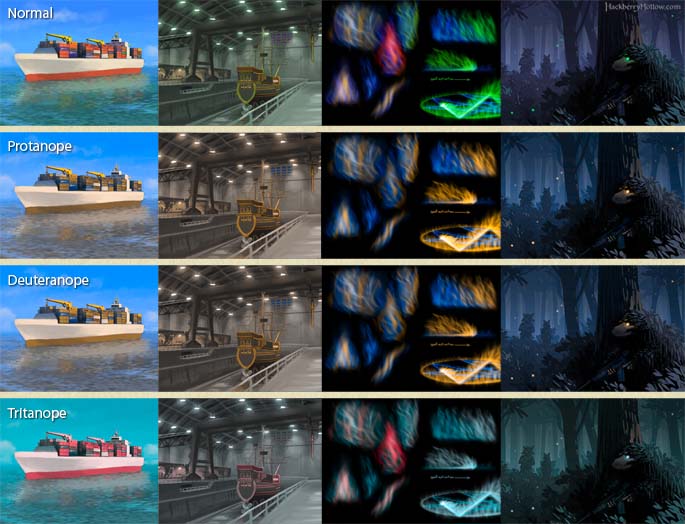
This past week gaming sites such as Kotaku, Rock Paper Shotgun and others have been covering an unfortunate gameplay mechanic in the recently released Bioshock 2. It has a hacking minigame where it is necessary for the player to identify red and green bars. The problem is that apparently 7-10% of males (and 0.5% of females) are color blind and couldn’t tell the difference.
I didn’t realize how common color blindness is, and since I’ve been living and breathing Hackberry Hollow I quickly realized that our magic system is color coded which will cause problems for our color blind readership. So, how will color affect our color blind readers and how are we planning to address the issue?
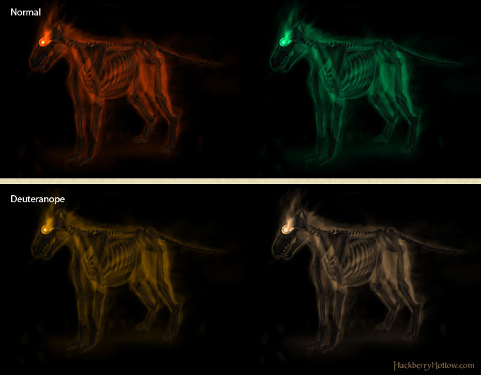
A ghoul vs. undead, and how they will be seen by people who have deuteranope where the M-cone is absent (2% of the population). Deuteranope simulated with Vischeck.
It goes without saying that we are still going to keep the color coding, but we want to make sure that the color coding is not the only way to tell what type of magic is being used. Red, green, yellow and blue work very well for the story, and thankfully blue—which in our magic system is [censored by the Anti-Spoiler Committee]—just happens to be the one color that most people who are color blind people can see. Yellow is used as the general color for magic and red and green are only used in necromancy. So the trick is figuring out how people with the most common type of color blindness will be able to the difference between red and green.
Step 1. Take cues from accessibility guidelines for traffic signs. Use shapes and value to communicate information.
Yes, my background is in graphic design and I should know better. I always design black and white first, no matter if it’s a logo, brochure, or painting. Once I’ve done a black and white value study then I’ll add color on top of that. If any kind of design holds together in gray scale then it will hold together in color as well. So our new ghouls will have a much different style in the way the magic effects are drawn and their posture that will help communicate the difference.
Step 2. Again, take cues from traffic signs. Use a blue-green instead of straight green.
The green I used for undead actually does shift a little bit towards blue, and I may push that a little bit more but not too much. In the above image I pushed the green to be more blue than usual, which is why someone with Deuteranope can see it as a lighter shade of yellow.
Step 3. Test all the designs next to each other in black and white to make sure they can be differentiated.
When I created the undead/ghoul concept art I took the same character (which did work well in gray scale on its own) and simply shifted the hue. I didn’t do the gray scale test after the image was completed. If I did that I would have caught a problem with the comic being reproduced in black and white, which I knew would have been a problem for people reading our comic on laptops/tablets/e-readers with e-paper or Pixel Qi screens in the sunlight.
We may have gotten around to doing that test further down the road when we do character line ups, testing the silhouettes and such, but in the future we should do it sooner than later so we can catch these kinds of design problems earlier. If our entire comic book holds together in black and white then we got all four flavors of colorblindness covered.
But there’s a dilemma.
There’s one line in the story where color is referenced that is very important. We thought about what we could do to change it so that our color blind audience isn’t left out, but we couldn’t figure out an alternate line of dialog that could take its place. Basically we were painting an image in the audiences mind through dialog about what something looks like, and once they actually see it for the first time it will have a huge suspenseful payoff, which about 95% of our audience will appreciate.
But what about our color blind audience? We got a plan for that. Once they see that particular object for the first time they’ll be able to clearly tell the difference from then on, but until then we need to let our color blind audience know to not worry. We thought about it and we got them covered, and they’ll know what the characters described when they see it.
But how exactly are we going to communicate that to our color blind audience? Bwahaha. Lets just say that not everything we are making gets posted on the blog.
Okay, so this article on color blindness was interesting, but what about new concept art? We’ll do another post later this week of the new ghoul design so you can see where we’re thinking of going with it.
In the meantime, here’s another picture of a squirrel.


Austin says:
February 16th, 2010 at 12:42 pm
I have a friend that has the level of colorblindness where he only sees gray-scale. the funny thing was, when we played hide and go seek when i was a kid, if you were wearing a white shirt you could pull it over your head and down over your pants and shoes and sit back against a white wall, and he would walk right past you. it was pretty funny. usually he herd you laughing though.
Adam Weber says:
February 16th, 2010 at 2:32 pm
Wait, the normal and deuteranope pictures look exactly… OH CRAP!!!
Higgins says:
February 19th, 2010 at 12:17 am
I like the level of research you did into the subject, and that you are actively keeping it aware when developing Hackberry Hollow. I like how the general solution, aside from value being the primary key, is to shake it up with the colors a bit. More and more I’m noticing a lot of folks focus on a single color for an element of an illo (say, green) without adding in environmental effects and reflections to give it a broader spectrum and make it more visually interesting. Good advice all around.
Shaun Williams says:
February 19th, 2010 at 2:05 am
Interesting that most of my work is with a blue accent color. Very interesting.
Wow, you guys. Awesome work on the subject. This will stand out as a high level of awareness to the readers. I’m very impressed! Glen, as always, Your posts are awesome. Thanks for the squirrel. Memories of old times. 😀
Erica says:
February 19th, 2010 at 9:37 pm
Take this from someone who knows exactly what she’s talking about: People who are color-blind typically know that they are and have found ways to work around it. I appreciate you thinking about it and altering your ghostly apparitions so they look different from each other – but seriously, you don’t need to change your text.
Adam Weber says:
February 19th, 2010 at 11:16 pm
I know two people who are color blind (that I know of, people don’t exactly go around with a billboard advertising this) and though two people is a really small sample, both admitted to getting frustrated when playing games that require you to distinguish green and red. We’re not changing the dialog, but we are going to inform the (colorblind) reader when that line comes up that we didn’t forget about them.
Our goal is to make Hackberry Hollow as good an experience as possible. Though color blind readers may have ways to work around this issue, they shouldn’t have to; and while they may not mind if we ignore them, they’re likely to appreciate the fact that we didn’t.
And if they’re hostile to the idea of being thought of, then they need to lighten up. 🙂
Glen Moyes says:
February 20th, 2010 at 3:28 am
Yes, we won’t be changing the dialog, and the method for letting color blind readers know what’s going on won’t be distracting (it’ll make sense once we reveal more in the future).
I’ll add though that this issue of colorblindness and telling the difference between undead and ghouls won’t be nearly as much of a problem in an animated version of Hackberry Hollow (yes, we have been thinking about that possibility down the road; we do after all eventually want to get into producing animation). There’s technically two versions of the script. There are notes for things that apply only to the comic book version and a potential animated version. The ghouls will not only look different, but they’ll move differently and also SOUND differently. But unfortunately we can’t animate anything or add sound effects to the comic—well, at least not without typing, “BAM!” “SQUISH!” “ARRROOOWWW! UNEARTHLY HOWL!” etc., so we have to make do with what we can communicate with still images and dialog.
Either way, using more than just color to show the difference between designs is a good idea and, we learned our lesson (again).