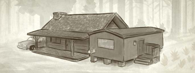
Environmental Concept Art 2
We are departing from our usual backstory concept art this week. Typically when we do environmental concept art we make it in full color so we can figure out the general mood for the environment, but in the case of Preston’s cabin we wanted to make sure that we develop something iconic. When designing the main character’s home we decided that the structure of the building should be figured out before the color, lighting, and the surrounding environment.
We tried various designs for the cabin to make it look unique, like having multiple stories, cantilevers, or something to add to the architectural complexity of the cabin, but nothing seemed to reflect Preston’s character and lifestyle better than a simple cabin. The single-wide trailer next to the cabin was part of the original concept, and we think that the trailer alone helped make the combined home unique enough so that it would be easily recognizable, and communicated a lot about the type of character Preston is.


Matt says:
April 30th, 2009 at 6:00 am
Most backwoods cabins I’ve seen have their mailbox down the driveway back on the main route. Keeps the mail deliverer from having to drive up every driveway, and keeps some privacy. Not sure if you considered that, maybe you have and you wanted to keep everything that is this guys home in one little cube. Don’t think it matters all that much though.
Glen Moyes says:
April 30th, 2009 at 10:17 am
Ah. Good point. Thanks for the input. 🙂
rex says:
May 7th, 2009 at 3:13 pm
hey it looks great! i like trailer (most backwoods people use ’em cause they’re cheap.) i can’t quite tell wether it’s a truck or a suv. it doesn’t matter, really, but it’s easier to drive back roads with a 4×4 truck then an suv. i can’t wait to see it when it comes out!