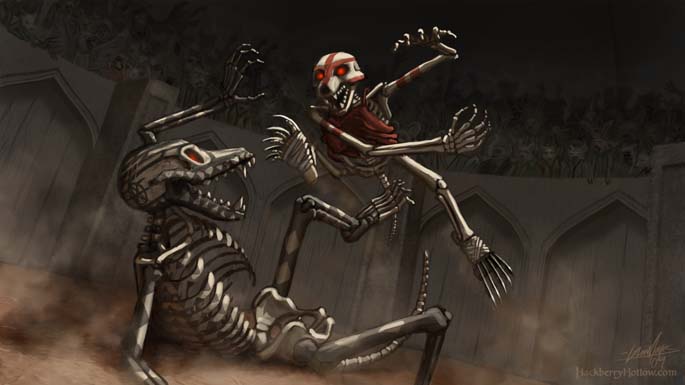
Backstory Concept Art 1
Whenever I do concept art I try to put some kind of visual narrative that hints at the story, or in this particular case the backstory. For this image I could have simply done a vignette of the two just standing there because the fighter design is all we wanted to focus on, but I went ahead and pictured them in the middle of battle with a onlooking crowd because it gives the two fighters context and a better visual narrative of the story which may inspire us with new ideas. Story influences art, art influences story, and it’s harder for the art to influence the story if I painted the characters standing there doing nothing.
One of the things I focused on was the skeleton design. We are still not sure about the skulls yet. We are doing animal characters so having a human-animal hybrid skull seems to be the obvious solution, but we haven’t settled on a design yet because we need to finalize the character design first. We are detail nazis, so we want to make sure that the made-up anatomy is consistent and plausible, even down to where the external acoustic meatus (i.e., the ear hole) goes on the skull, which I did have to adjust along with other parts of the skull because Adam called me on it.
All this research, attention to detail and consistency within the story and visual design pays off. If we are grounded in reality through everything we do, all the made-up stuff will be more believable.
Another goal for this piece was to do a full render of the illustration as opposed to the loose alla prima painting I usually do. I haven’t done a refined illustration in a while and I wanted to see how this particular style would look fully rendered. This is pretty close to the amount of rendering we are expecting to have in the final comic.
We’ll be keeping our Tuesday update schedule which appears to work out well. We’ve decided that most of the concept art we’ll be posting in the near future will be from the backstory which takes place about 18 years before the story starts. That way we won’t spoil anything, and it gives us time to work on the concept art needed for the first chapter.


Erica says:
April 7th, 2009 at 7:06 pm
All bow to the Detail Nazis – Heil Artwork!
~Amazing, as always.
Glen Moyes says:
April 7th, 2009 at 7:07 pm
Thank you! 🙂
himanshu dangra says:
October 14th, 2010 at 12:15 pm
hello frnd,
u r show everything show this picture. but my think is saying something missing this picture like a every story picture tells something who is wrong and who is right. ur art n creativity is good ur art work not showing who’s fighter fight for truth .
both fighter texture n colors are same like a devil also eyes if eyes colors is something different so we can understand easily who’s fighter fight for truth. coz colors are so important for story briefing. if u r some different colors used by u or ur texture artists ur story tells everything n without reading story we can made a story. and ur story is idle story.