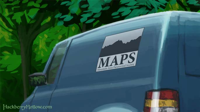
Vehicle Concept Art 9
For this concept we focused primarily on the logo design for MAPS (Mountain Area Paranormal Society). Two of us are graphic designers, and so we decided to have a little fun. We wanted to create a logo that doesn’t look terrible, but definitely looks cheap.
 Our inspiration for this logo was based on our experience of being in Eastern Idaho and Western Wyoming, where it seems like every other logo has the Grand Teton’s, even the business that aren’t located anywhere near the Tetons.
Also we would like to thank Glen for successfully creating a vehicle without any of the rage that he felt the previous time that he had while doing vehicle design.


Shaun Williams says:
December 16th, 2009 at 3:32 pm
this is a great image guys. and I love the logo. a true middle ground to say what you needed. 🙂 Glad Glen was in better spirits about this one.
William says:
December 16th, 2009 at 4:03 pm
Was the self-similarity in the mountian range done on purpose? If you rotate the logo 180 and then invert the colors, there is very little diffrence between the before and after versions of the mountians (the only diffrence I see is one little bump, and that is hard to spot).
Adam Weber says:
December 16th, 2009 at 5:21 pm
I guess MAPS didn’t spend that much on their logo. But you know what they say: it takes a really good designer to create a truly bad design. Anything in-between is just amateurish.
Glen Moyes says:
December 16th, 2009 at 5:29 pm
We’ll be changing the mountain design in the logo to match the actual mountains as they appear in the comic. We haven’t designed the mountains that the logo will be based on yet. 🙂