Prop Concept Art 2
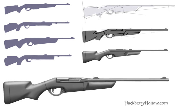
This is the start of the process of this particular prop design (we’ll be posting more finished designs of this prop later).
We’ve established Preston, the main character, as somewhat of a redneck. Nothing says redneck more than someone who lives in the wilderness in an old cabin, drives an rusty truck that barely holds itself together, but yet he also owns the best modern firearms that a civilian can legally buy.
“Best modern firearm? But where’s the scope?” you may say. Oh you of little faith. Preston is a redneck. He doesn’t need a scope.
For weapon design I like to start out with the silhouette shape first and find what works there. It’s easy to move things around and change the proportions and angles by adding solid shapes and shaving off angles with the eraser tool. It kind of feels like sculpting, which is why I like it. Plus the silhouette of a character or prop is the most important part of the design, so why not start with that. From there I’ll add some guidelines, figure out what all of the angles of the design are doing so I can adjust them and hopefully strengthen them. After that I usually do the rest of the adjustments free hand as to what feels right.
I had to consider the probable character design for the grip of the gun. The character’s hands will be bigger in proportion to a humans, so I needed to take that into account, which is why the trigger guard and grip is much bigger. And having the bigger grip does do some interesting things to the shape of the gun, which makes it more appealing and unique to this comic.
We’ll be spending a lot of time on this weapon because Preston has it with him pretty much most of the time, and will probably also be one of the props that we’ll make a 3D model out of because of how often it’s shown.


Greg says:
October 11th, 2010 at 9:53 am
I noticed on the upper right hand sketch that you had lines around the outside and inside of the gun.
Why is this, what does it help you do when creating the concept?
Glen Moyes says:
October 11th, 2010 at 3:14 pm
Probably too long of an explanation, but hey, it’s for posterity and we are trying to record our process of how we learned. So here it goes.
This was actually based on something that I observed when looking at different product designs, trying to reverse engineer why different designs look good. Because I’m a graphic designer by background I tried to center what I was observing with gun design into what I know about graphic design.
In graphic design we have this thing called a grid system. The grid is a way for designers to align columns of text, images, and other graphical elements onto a design so everything fits (grid systems are usually 12 or 18 columns on a page with a gutter between them). For some reason our minds like alignments and mathematical proportions, so when doing designing a page layout we are always thinking about how things align to each other.
Page layouts almost always have a grid of parallel and perpendicular lines because text is a series of parallel lines, but for logos, scene compositions, and props we can break out of parallel and perpendicular guides and into the realm of triangles and curves. Same thing applies to a pose. We do lines of action and gesture drawings before moving on to a finished illustration to see if we like what we are communicating with our angles and alignments. With scenes we’ll draw a series of curves and straight lines (more or less depending on how we want the scene to feel), and then we move on from there. So I did the same exact thing with the gun (although with the gun I started with the silhouette first just to get my mind going).
By drawing on top of other (real world) gun designs that I liked, I could carry the lines of the gun design out so I could see those guidelines. To me it felt like the gun designs had lots straight angles, angles that converged to the tip of the gun, probably to visually communicate that the weapon is accurate. I noticed that angles for the grip and other parts of the gun that make it ergonomic, often converged upon other parts of the gun that had an ergonomic function. And when I hid the photo layer in Photoshop and saw only the guidelines, just the guidelines themselves looked interesting as if the guidelines were intended to be beautiful on their own.
So I looked at that and went, “Huh, that’s interesting,” and tried it myself. That’s what gave me the idea to try that, to try and create a design of guidelines that visually communicated a modern accurate weapon, and looked interesting, and that process worked out pretty well. It’s about trying to find alignments in the design, where angles converge, and if you like the statement that the converging angles make. It’s gesture and line-of-action from character design and posing applied to prop design.
It’s kind of crazy how all these unrelated fields of scene composition, graphic design, characters, and props all relate to each other. 🙂
Greg says:
October 12th, 2010 at 3:45 pm
Wow, that’s a fantastic answer. I was hesitant to even ask the question at first, I’m so glad that I didn’t. I learned a lot from your write up. I’m an artist by trade myself and look forward to trying this out.
I love the blog, you guys are making great progress! Thanks again, and keep up the good work 🙂